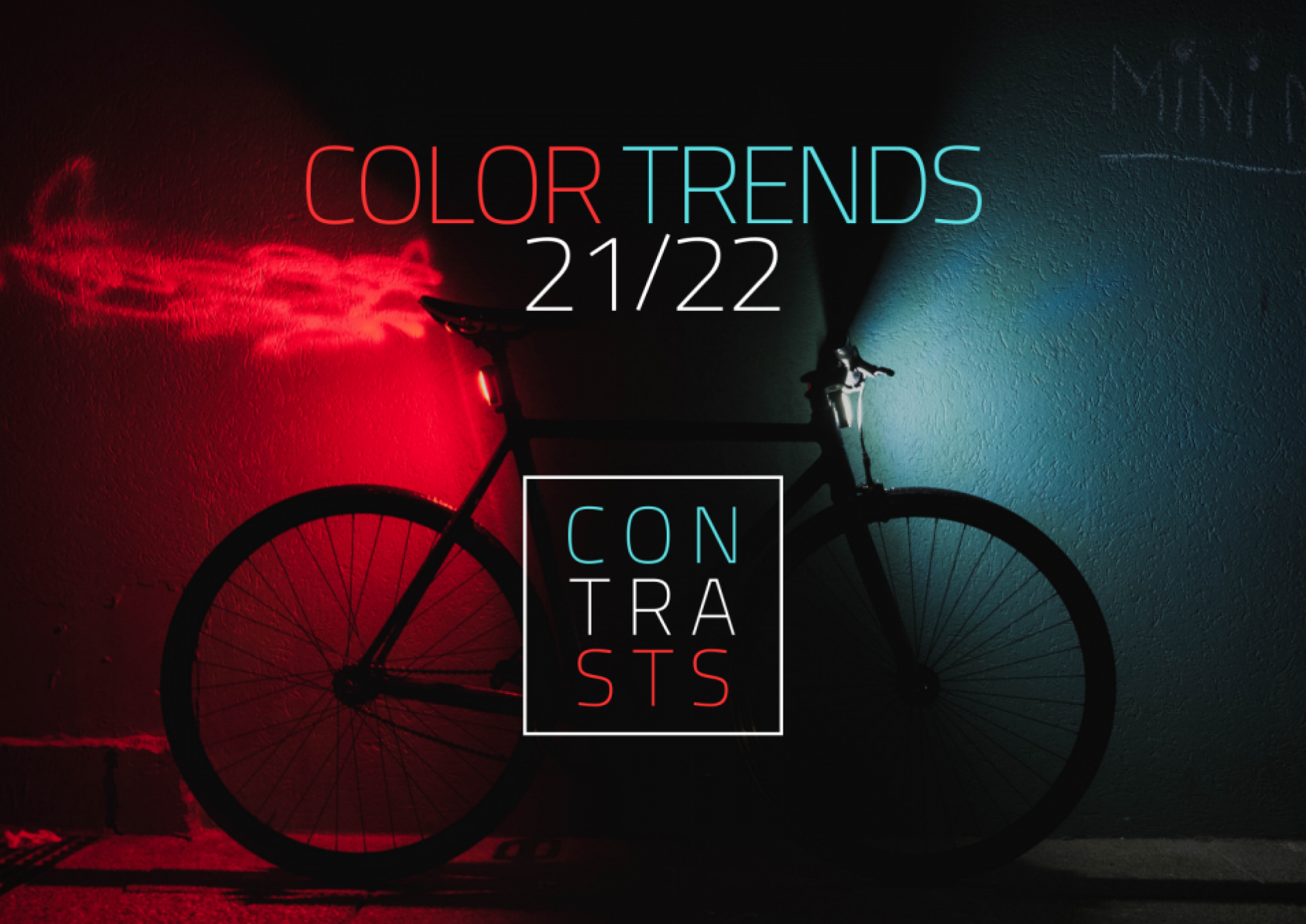
Video: Contrasts in perfect harmony
During these turbulent times we want to cheer you up with the release of our latest video for Color Trends ’21/22. Enjoy!
The sppot stands for surface-protection-performance and trend in one place. As our name suggests, trends are deeply rooted in our culture, driving our core mission to be the leading source of color and effect solutions for the bicycle and sporting goods industry. Integral part of this vision is Color Trends – campaign through which we share our passion, knowledge and expertise; thus, guiding you in the process of color selection.
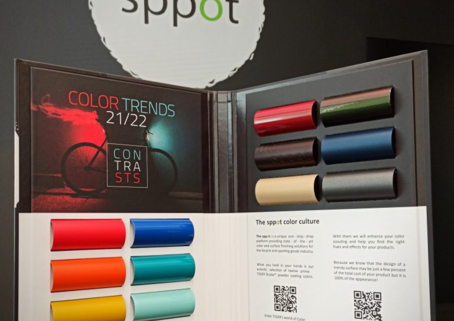
Every year we release a special collection colors which are the result of our color scouting, product development and dash of inspiration. More specifically, the selected colors represent our reflection and interpretation of the latest developments in the cycling industry and draw inspiration from nature, society, and trend setting industries such as fashion, automotive, interior and graphic design.
For this year we have prepared Color Trends ’21-22 – new collection of special hues and effects specifically selected for the needs of the Bicycle and Sports & Leisure industries. More specifically, our new selection present two contrasting but divine palettes of nature and cosmic inspired colors and effects which together create a perfect harmony.
If you enjoy what you saw and you want to learn more about our latest selection, we would be happy to present you the new colors online. Contact us at office@the-sppot,com to arrange the details.

Because we know that the design of a trendy surface may be just a few percent of the total cost of your product but it is 100% of the appearance!
PDF FILE Array


